[16일차] ABC 부트캠프 - 데이터 수집 및 분석 (팀 프로젝트 발표 : 서울 쏠림 현상)
안녕하세오 !! 서루태에오,,

오늘도 어김없이 부트캠프 수업을 들으러 왔어요
월요일이라 그런가 힘이... 주르륵.. 게다가..
오늘은 팀 프로젝트 발표날...

그래도 어쩌겠어요!
모두들 월요일 화이팅!!!
저희 조의 팀 프로젝트 주제는
서울 쏠림 현상 : 20대 이동 및 사회 인식 분석
처음에 주제를 정할때 고민을 많이 했어요
처음엔 웹툰 분석, 게임 분석, 대학 분석, 영화 분석...등등
많이들 있었지만 서울 쏠림 현상을 하게된 결정적 이유는
'멋있어서'
ㅋㅋㅋㅋㅋㅋ
사회적 문제를 팀 프로젝트로 정하면 재미는 조금 떨어져도
흥미와 멋을 챙길 수 있잖아요? ㅎㅎ
그래서 덥석! 주제를 물어왔답니다!
먼저 서울에 얼마나 몰렸길래! 이렇게들 호들갑일까?
그래서 서울로의 이동인구를 먼저 파악하고 시각화하고 싶었어요.
그래서 데이터를 하나 불러왔어요!
kosis 국가통계포털
https://kosis.kr/index/index.do
KOSIS 국가통계포털
내가 본 통계표 최근 본 통계표 25개가 저장됩니다. 닫기
kosis.kr
20대 남녀의 시도별 이동건수를 들고왔어요.
move_df = pd.read_csv('/content/drive/MyDrive/ABC/20대_전국이동수.csv')
move_df = move_df.copy()

move_df= pd.DataFrame(move_df)

#시점에 따라 각 지역별 이동 추이를 보기 위해 인덱스로 설정
move_df.set_index('시점', inplace=True)
잠깐 봐도 서울의 인구 이동이 엄청 높죠?
좀 더 보기 편하게 시각화 해볼게요
import koreanize_matplotlib
koreanize_matplotlib.koreanize()
from matplotlib import font_manager, rc

# 시각화 설정
plt.figure(figsize=(14, 8))

# 각 지역별로 시계열 그래프 그리기
for column in move_df.columns:
    sns.lineplot(data=move_df[column], label=column)

# 그래프 타이틀과 축 레이블 설정
plt.title('지역별 인구 변화 추이', fontsize=16)
plt.xlabel('년도', fontsize=14)
plt.ylabel('인구 수', fontsize=14)

# 범례 추가
plt.legend(loc='right', fontsize=12)

# 그래프 출력
plt.tight_layout()
plt.show()
보시면 빨간색 선을 기준으로
아래쪽은 인구 수가 감소했구
윗쪽은 인구 수가 증가했어요
이걸 저희는 지도에 표시해서 서울에 얼마나 몰렸는가를
극단적으로 시각화하기위해
2001년과 2023년의 인구 이동을 지도에 나타내 봤어요!
#2001년 20대 인구이동 지도
selected_year = 2001

# 선택된 연도의 데이터 추출
selected_data = df[df['시점'] == selected_year].iloc[0]
# 지도 생성
map_2001 = folium.Map(location=[36.5, 127.5], zoom_start=7)

# 지역별 CircleMarker 생성
for city, location in city_locations.items():
    population_change = selected_data[f'{city}_인구']
    color = 'red' if population_change > 0 else 'blue'
    radius = abs(population_change) / 1000  # 마커 크기 조정 #abs() 절댓값으로 반환하기

    folium.CircleMarker(
        location=location,
        radius=radius,
        popup=f"{selected_year} {city}: {population_change}",
        color=color,
        fill=True,
        fill_color=color
    ).add_to(map_2001)

# 지도 표시
map_2001

#2023년 20대 인구이동 지도
selected_year = 2023

# 선택된 연도의 데이터 추출
selected_data = df[df['시점'] == selected_year].iloc[0]
# 지도 생성
map_2023 = folium.Map(location=[36.5, 127.5], zoom_start=7)

# 지역별 CircleMarker 생성
for city, location in city_locations.items():
    population_change = selected_data[f'{city}_인구']
    color = 'red' if population_change > 0 else 'blue'
    radius = abs(population_change) / 1000  # 마커 크기 조정 #abs() 절댓값으로 반환하기

    folium.CircleMarker(
        location=location,
        radius=radius,
        popup=f"{selected_year} {city}: {population_change}",
        color=color,
        fill=True,
        fill_color=color
    ).add_to(map_2023)

map_2023

[display(map_2001), display(map_2023)]
 |
 |
왼쪽이 2001년, 오른쪽이 2023년의 이동인구랍니다!
한 눈에 봐도 서울을 제외하고는 약성장, 혹은 감소를 보이고 있어요..!
아.. 서울 쏠림 현상이 이렇게나 심각하구나!
지금 이런 현상에 대해서 사람들은 어떻게 생각을 하고 있을까?
저희 조는 이곳에 중점을 맞춰서 크롤링을 하려고 노력했어요.
그래서 준비한 데이터가
SBS 유튜브채널의 "서울 인구 폭발하는 2035년, 진짜 서울 공화국? 교육 격차는 어디까지.."
이 영상의 댓글을 데이터화했답니다!
from selenium import webdriver
from webdriver_manager.chrome import ChromeDriverManager
from selenium.webdriver.chrome.service import Service as ChromeService

from bs4 import BeautifulSoup
import time

import pandas as pd

import warnings
warnings.filterwarnings('ignore')

options = webdriver.ChromeOptions()
options.add_argument('--no-sandbox') # 보안 기능인 샌드박스 비활성화
options.add_argument('--disable-dev-shm-usage') # dev/shm 디렉토리 사용 안함

service = ChromeService(executable_path=ChromeDriverManager().install())
driver = webdriver.Chrome(service=service, options=options)
driver.set_window_size(800, 800)

# 유튜브 영상 접속 https://www.youtube.com/watch?v=GzEADMhZr-g
driver.get('https://www.youtube.com/watch?v=GzEADMhZr-g')
driver.implicitly_wait(10) # 화면 렌더링 기다리기

# 사람 인 척 하기
time.sleep(10)
driver.execute_script('window.scrollTo(0,800)')
time.sleep(5)

# 댓글 수집을 위한 스크롤 내리기
last_height = driver.execute_script('return document.documentElement.scrollHeight')

while True:
    print('스크롤 중...')
    driver.execute_script('window.scrollTo(0,document.documentElement.scrollHeight);')
    time.sleep(3)

    new_height =  driver.execute_script('return document.documentElement.scrollHeight')

    if new_height == last_height:
        break

    last_height = new_height
    time.sleep(3)

#댓글 크롤링
html_source = driver.page_source
soup = BeautifulSoup(html_source, 'html.parser')

#댓글 태크 리스트 가져오기
comment_list = soup.select('yt-attributed-string#content-text')
comment_final = []

print('댓글 수: ', str(len(comment_list)))

#댓글 텍스트 추출
for i in range(len(comment_list)):
    temp_comment = comment_list[i].text
    temp_comment = temp_comment.replace('\n', '').replace('\t', '').replace('\r', '').strip()
    print(temp_comment)
    comment_final.append(temp_comment) #댓글 내용 리스트에 담기

#데이터 프레임 만들고 저장(list -> dict -> df)
youtube_dic = {'댓글 내용': comment_final}
youtube_df = pd.DataFrame(youtube_dic)

print('==' * 30)
print('크롤링 종료')
print('==' * 30)

# 수정된 데이터 확인하기
print(youtube_df.info())

youtube_df.to_csv('서울_교육격차_유튜브_크롤링_20240711.csv', encoding='utf-8-sig', index=False)

print('==' * 30)
print('파일 저장 완료...')

#브라우저 닫기
driver.close()
댓글들로 csv파일을 만들어줬어요.
그리고 시각화 해볼게요!
group_df = word_df.groupby('word', as_index=False).agg(n=('word', 'count')).sort_values('n', ascending=False)

fig1 = px.bar(group_df.head(20), x='word', y='n', text='n')
fig1.update_layout(title='서울 교육 격차 유튜브 단어 빈도 수 TOP20', xaxis_title='단어', yaxis_title='빈도수')
fig1.update_traces(marker_color='red')

# make_subplots를 사용하여 서브플롯 생성
fig = make_subplots(rows=1, cols=2, subplot_titles=('서울 교육 격차 유튜브 단어 빈도 수 TOP20', '서울 교육 격차 뉴스 기사 단어 빈도 수 TOP20'))

# 그래프를 서브플롯에 추가
fig.add_trace(fig1['data'][0], row=1, col=1)

# 서브플롯의 레이아웃 설정
fig.update_layout(showlegend=False)

# 그래프 보이기
fig.show()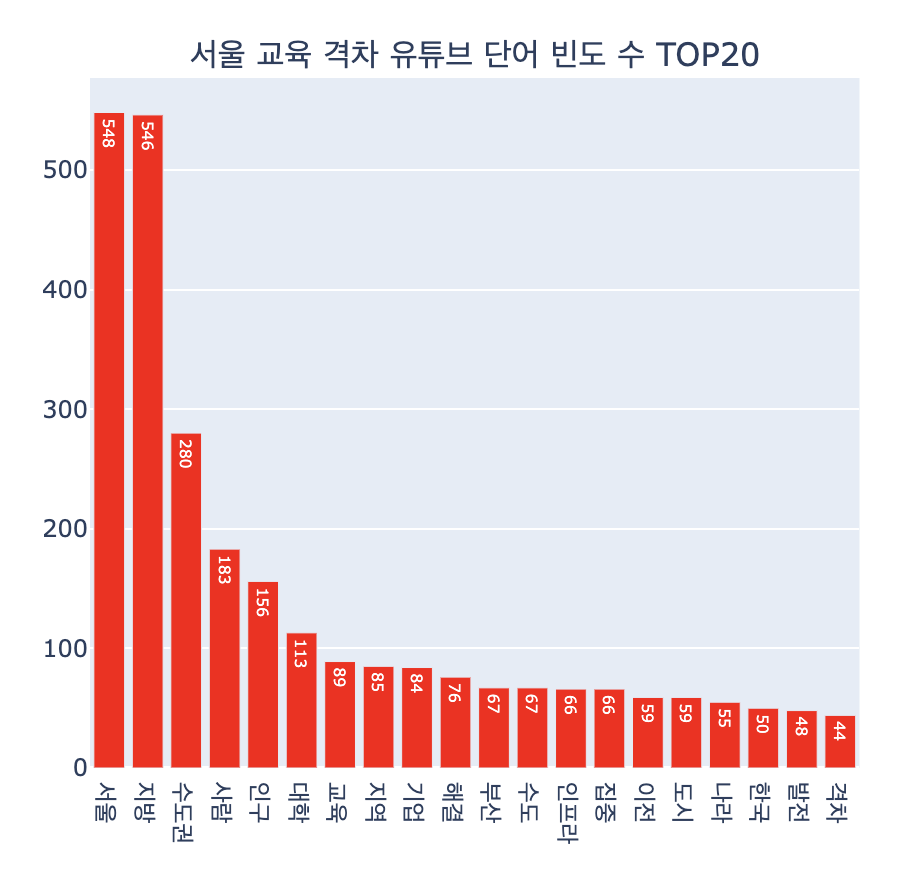
서울, 지방, 수도권에 대한 이야기들이 많았어요!
이걸 보고 요약하면 수도권과 비수도권의 차이를 비교하는 댓글이 많은 것 같아요.
저희 조는 여기서 감성분석 이란걸 따로 도입해서 분석해 봤어요.
감 성 분 석
감성 분석이란?
감성분석은 이미 구축되어 있는 감성어 사전에 기반하거나,
기계학습을 이용해 사전을 구축한 후 해당 사전을 이용하는 방법이 있어요.
저희는 기계학습을 진행할 수는 없으니
이미 구축되어 있는 감성어 사전을 다운받아서 쓰기로 했어요.
json 파일을 하나 올려드릴게요!
저희는 저 감성사전을 가지고서 데이터 분석을 실시했어요.
감성사전 불러오기
sentiword = pd.read_json('/content/SentiWord_info.json')json 파일 하나를 읽어와줄게요
감성 점수 계산 함수
# 감성 점수 계산 함수 (NaN 처리 추가)
def sentiment_score_per_repl(comment):
    repl_score = 0
    try:
        if isinstance(comment, str):  # comment가 문자열인지 확인
            for root, score in zip(sentiword['word_root'], sentiword['polarity']):
                if root in comment:
                    repl_score += score
    except TypeError:  # TypeError 발생 시 pass (무시)
        pass
    return repl_score

# 각 댓글에 대해 감성 점수 계산하여 데이터프레임 생성 (NaN 처리)
youtube_df['댓글 내용'].fillna('', inplace=True)  # NaN 값을 빈 문자열로 대체
df_sentiment = pd.DataFrame({
    '댓글 내용': youtube_df['댓글 내용'],
    '감성점수 총합': youtube_df['댓글 내용'].apply(sentiment_score_per_repl)
})
df_sentiment.reset_index(drop=True, inplace=True)
df_sentiment.head()
해당 함수는 내가 분석하고자 하는 데이터가 사전 안에 들어가 있다면 점수를 반영해줘요
모든 댓글에대해서 점수를 반영하고
그 점수를 df_sentiment라는 데이터 프레임에 담아줬어요!

일부 댓글만 가져왔어요
다들 부정적이죠? ㅠㅠ
감성점수 총합의 범위에 따라서
긍정 / 부정 댓글을 나눠줬어요.
# 긍정, 부정 댓글 필터링
df_repl_positive = df_sentiment[df_sentiment['감성점수 총합'] >= 0]
df_repl_negative = df_sentiment[df_sentiment['감성점수 총합'] <= -20]
긍정과 부정의 단어 데이터프레임을 시각화 해봤어요!
icon = Image.open('/content/긍정이미지.jpg')
positive_mask = np.array(icon)

plt.subplots(figsize=(8,8))
wc = WordCloud(width=1000, height=700, font_path=font_path, mask = positive_mask, background_color='white').generate_from_frequencies(dic_positive_word)
plt. axis('off')
img_colors = ImageColorGenerator(positive_mask, default_color=(255,255,255))
wc = wc.recolor(color_func=img_colors)
plt.imshow(wc, interpolation='bilinear')
plt.show()
icon = Image.open('/content/부정이미지.jpg')
negative_mask = np.array(icon)

plt.subplots(figsize=(8,8))
wc = WordCloud(width=1000, height=700, font_path=font_path, mask = negative_mask, background_color='white').generate_from_frequencies(dic_negative_word)
plt. axis('off')
img_colors = ImageColorGenerator(negative_mask, default_color=(255,255,255))
wc = wc.recolor(color_func=img_colors)
plt.imshow(wc, interpolation='bilinear')
plt.show()
저희가 발표한 기술적 부분은 요종도였어요!

이번 프로젝트에서 코드 병합과 발표를 맡았었는데
저는 파워 I ... 발표가 너무 힘들었답니다.. ㅎㅎ^^
그래도 어찌저찌 잘 해냈네요!!
여러분도 새로운 걸 도전해 보세요
수많은 도전은 자신을 아릅답게 만들어 준답니다.
오늘은 여기까지!
다음 시간에는 크롤링 말고 인공지능 공부로 돌아올게요!!
다들 안녕 ~~